Project Background
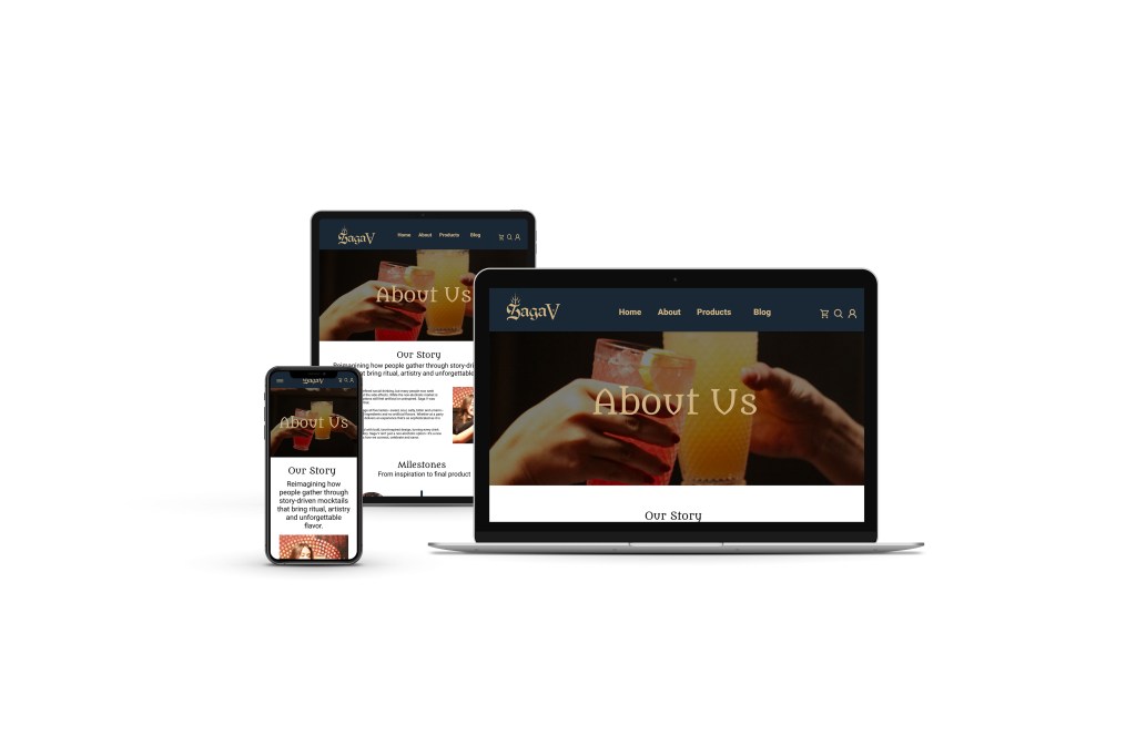
As part of a cross-functional creative agency, we were tasked with creating branding and storytelling for a new alcohol-free mocktail brand, Saga V. Our Brand, Content, Packaging, and Web team was given a two-week timeframe to complete this project. The required deliverables included a brand guide, photo and video assets, a line of packaging, and a responsive, multipage website prototype.
My Role
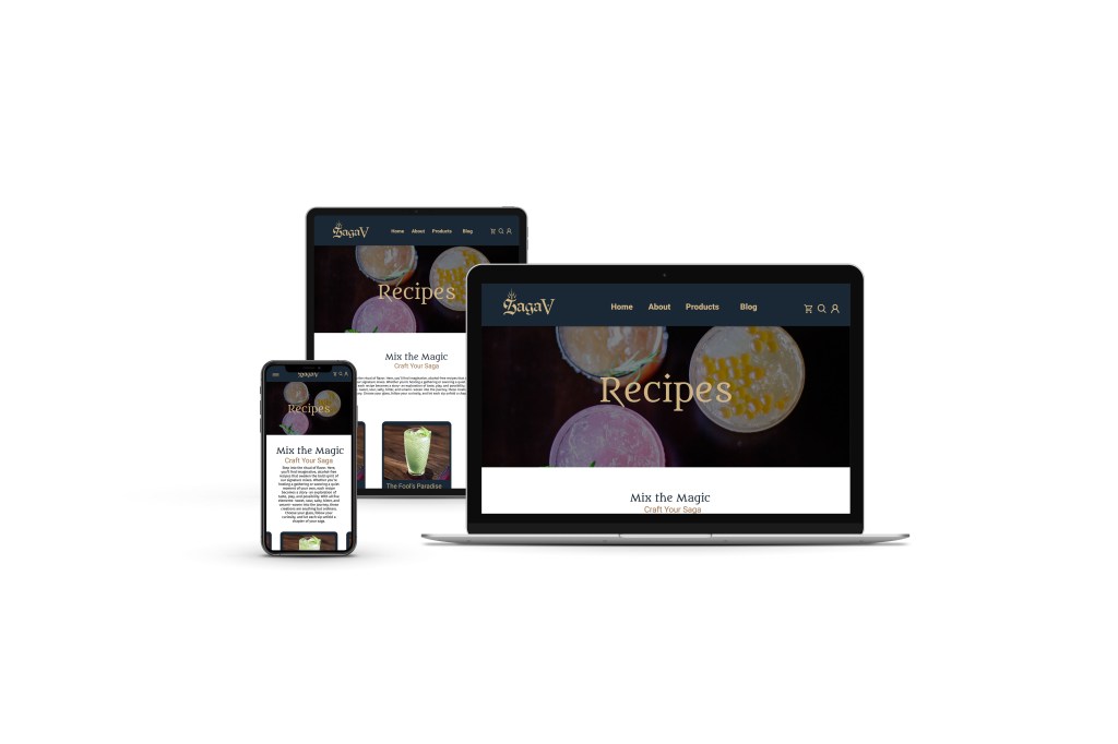
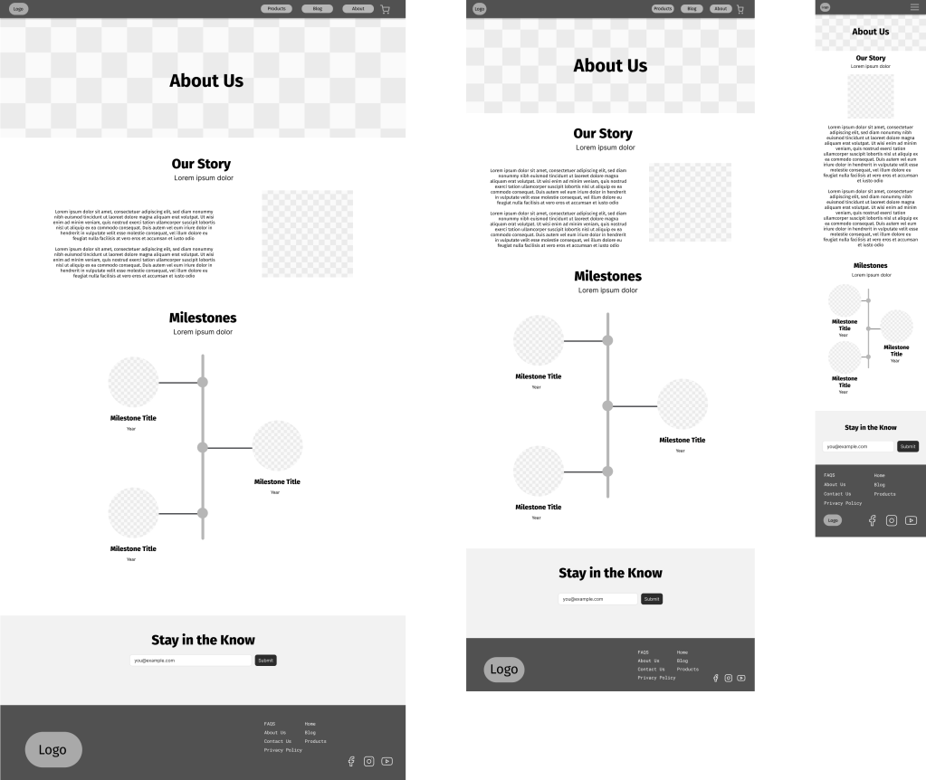
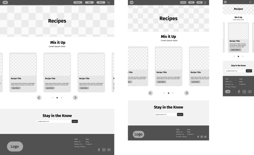
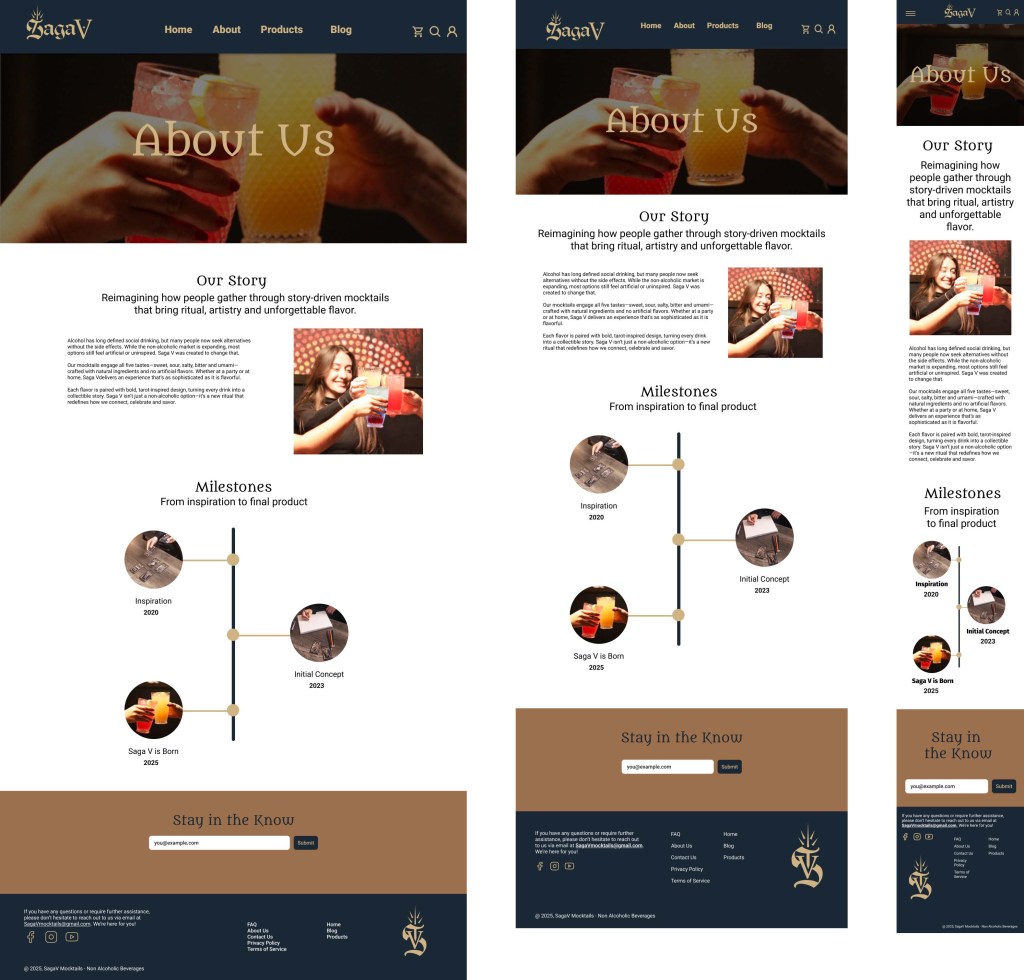
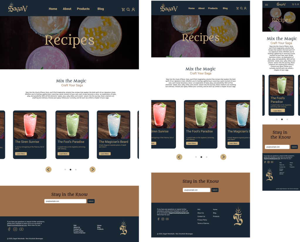
In my role on the Web Team, I was tasked with creating responsive, low-fidelity, and high-fidelity wireframes for the About and Recipe Blog website pages in Figma. Following the completion of each wireframe iteration, the development team would code the pages for the prototype. Since the brand identity was still being developed, I focused on the desktop, tablet, and mobile layouts and user experience of my wireframes.
Research & Early Exploration
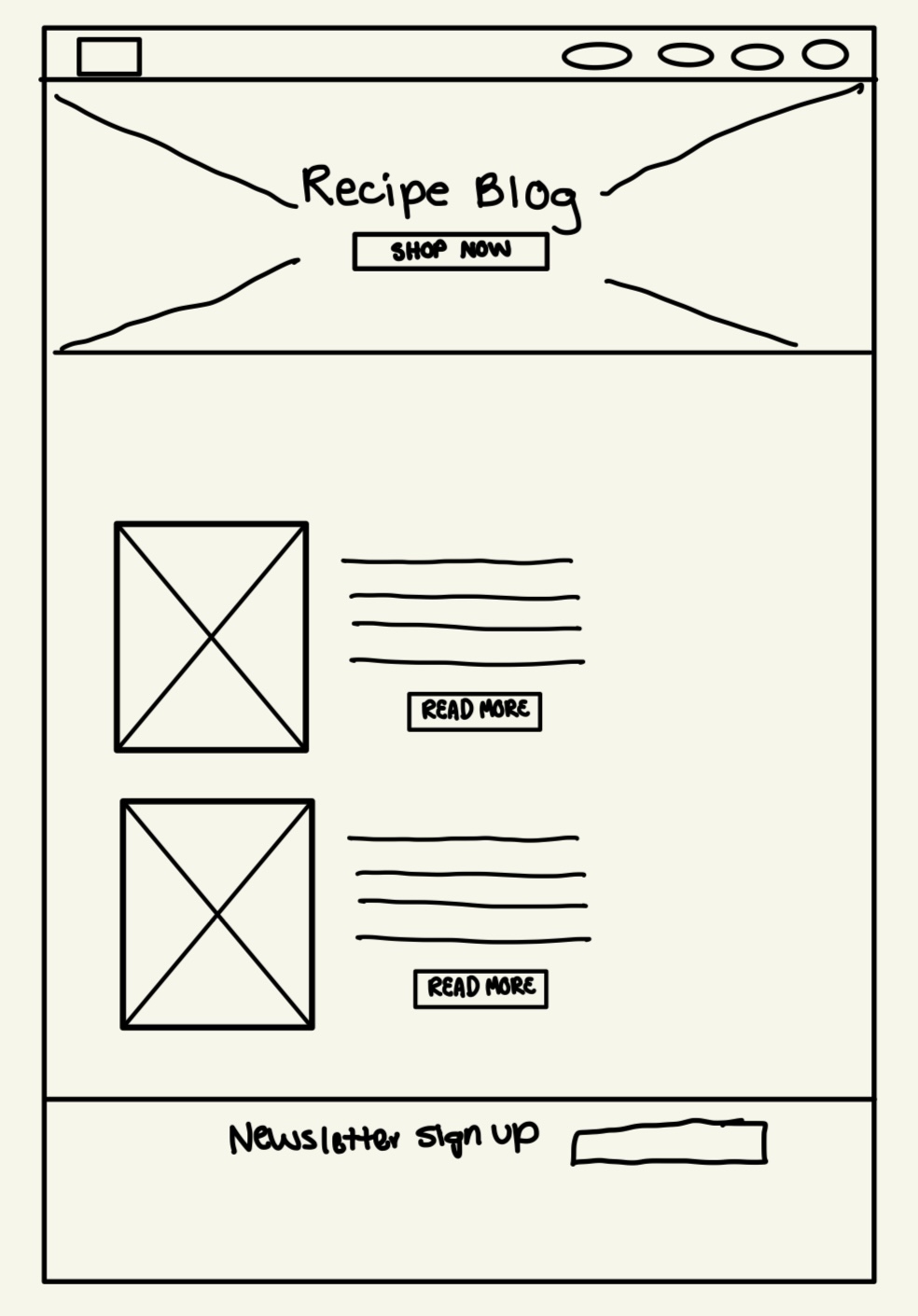
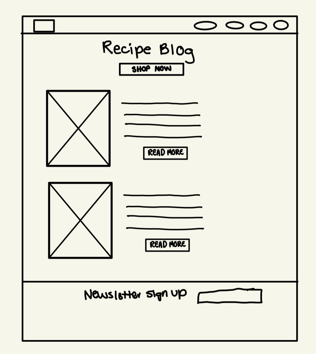
Research, sketching, and creating low-fidelity wireframes were essential stages in my process. Our team conducted research on the functionality and layout of our competitor’s websites. During our research, we discovered that many of our competitors’ websites featured bold visuals, incorporated calls to action, and adhered to accessibility best practices. Following the initial research, I began sketching out initial concepts for the layout of the About and Recipe Blog webpages by hand.
Iteration & Feedback
We adjusted our designs based on stakeholder feedback, evolving brand guidelines, which helped us determine which features would add value to the overall website. For example, one of our team’s concepts included a function that allowed users to create their own custom flavor blend. However, we did not move forward with this concept after receiving feedback from the brand team that it conflicted with their beverage flavor profiles.
Applying Feedback
I applied our stakeholders’ feedback to the hero sections of my webpages, by increasing the hero image size in the mobile layout, and to the body of the Recipe Blog webpage, by adding a short introductory section above the recipe card carousel. I ensured accessibility by applying contrast and readable text sizes. I communicated the wireframe changes to the development team.
Final Wireframes & Handoff
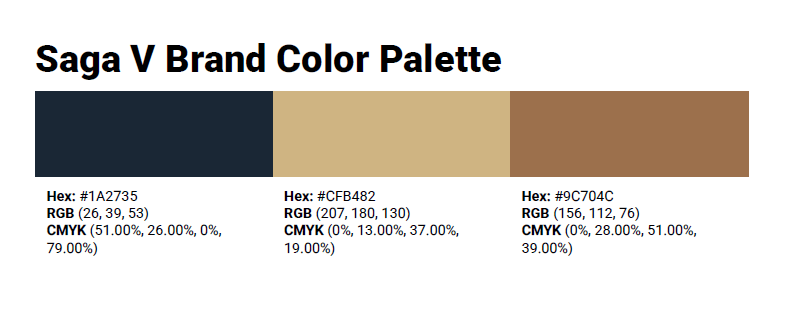
Once the brand guide was fully developed, I began applying the brand’s color palette, logos, typography, and images to my wireframes. I ensured text hierarchy and added an overlay to the hero sections of the About and Recipe Blog webpage to increase the readability of the header text. My final, high-fidelity wireframes were then passed to the development team to add necessary alt text, keyboard navigation, and bring the website to life as a functioning prototype.
Outcome & Lessons Learned
By the end of the two-week sprint, my team and I created a functioning prototype for the Saga V multipage website. I learned the value of open communication when working within a strict time constraint and with evolving project direction. I will take this iterative approach into all my future design projects.
